- Study
- Slides
- Videos
8.1 Introduction
Oscillating indicators, as their name suggests, are indicators that move back and forth as currency pairs rise and fall. Oscillating indicators can help you determine how strong the current trend of a currency pair is and when that trend is in danger of losing momentum and turning around.
When an oscillating indicator moves too high, the stock is considered to be overbought (too many people have bought the stock and there are not enough buyers left in the market to push the stock higher). This indicates the stock is at risk of losing momentum and turning around to move lower or sideways. When an oscillating indicator moves too low, the stock is considered to be oversold (too many people have sold the stock and there are not enough sellers left in the market to push the stock lower). This indicates the stock is at risk of losing momentum and turning around to move higher or sideways.
Before we further understand various oscillators, it is a good idea to understand what momentum means. Momentum is the rate at which the price changes. For example, if the stock price is Rs.100 today and it moves to Rs.105 the next day, and Rs.115, the day after, we say the momentum is high as the stock price has changed by 15% in just 3 days. However, if the same 15% change happened over to let us say 3 months, we can conclude the momentum is low. So the more rapidly the price changes, the higher the momentum.
Important Oscillating indicators Are:
- Moving average convergence divergence (MACD)
- Stochastic
- Relative strength index (RSI)
8.2 Moving Average Convergence and Divergence (MACD)
In the late seventies, Gerald Appel developed the Moving Average Convergence and Divergence (MACD) indicator. Traders consider MACD as the grand old daddy of indicators. Though invented in the seventies, MACD is still considered one of the most reliable momentum traders’ indicators.
As the name suggests, MACD is all about the convergence and divergence of the two moving averages. Convergence occurs when the two moving averages move towards each other, and divergence occurs when the moving averages move away.
A standard MACD is calculated using a 12 day EMA and a 26 day EMA. Please note, both the EMA’s are based on the closing prices. We subtract the 26 EMA from the 12 day EMA, to estimate the convergence and divergence (CD) value. A simple line graph of this is often referred to as the ‘MACD Line’.
For Example- If For example, on 6th Jan 2014, 12 day EMA for a stock was 6153, and 26 day EMA was 6198. Hence the MACD would be 6153-6198 = – 45
The sign associated with the MACD just indicates the direction of the stock’s move. For example, if the 12 Day EMA is 6380, and 26 Day EMA is 6220, the MACD value is +160. Under what circumstance do you think the 12 day EMA will be greater than the 26 day EMA? When-the shorter-term average will generally be higher than the long term only when the stock price trends upward.
Remember, the shorter-term average will always be more reactive to the current market price than the long term average. A positive sign tells us that there is positive momentum in the stock, and the stock is drifting upwards. The higher the momentum, the higher is the magnitude. For example, +160 indicate a positive trend which is stronger than +120.
When the MACD is negative, it means the 12 day EMA is lower than the 26 day EMA. Therefore the momentum is negative. Higher the magnitude of the MACD, the more strength in the downward trend.
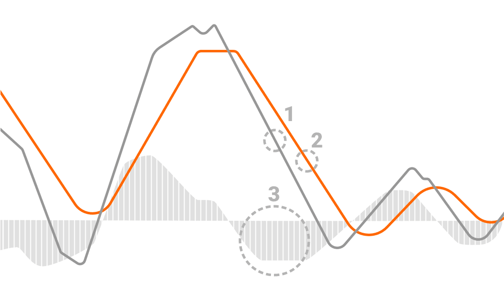
The Signal line is another portion of the MACD indicator. As for its value, we use the 9-period EMA of the MACD line. Its purpose is to help generate trading signals by identifying when there’s a turning point in the trend. The final part of the indicator is the Moving Average Convergence Divergence histogram. It represents the distance between the MACD line and the signal line. If the MACD line is above the signal line, the histogram is positive, and vice-versa.
Reading of the Indicator:
The indicator consists of three elements that move around the zero line: the MACD line, the signal line, and the histogram. Here is a bit more about each of them:
- MACD line (12-period EMA – 26-period EMA) – it helps traders determine upcoming bullish and bearish market trends;
- Signal line (9-period EMA of the MACD line) – it is analyzed in addition to the MACD line to help spot trend reversals and mark the most appropriate entry and exit points;
- Histogram (MACD line – Signal line) – the histogram provides a graphical representation of the convergence and divergence of the previous two, the MACD and the signal lines;
Each of these lines has a separate value. A MACD line with a positive value indicates that the shorter EMA is above the longer EMA. The further the shorter EMA is from the longer one, the bigger the increase in the positive value of the MACD line. This is an indication of mounting upside momentum. On the other hand, a negative MACD indicates that the shorter EMA is below the longer one. Once again, the negative values increase as both lines diverge further. In that case, we have an increasing downside momentum.
Depending on the movement of the exponential moving averages, the correlation between them can be either divergent or convergent. Divergence takes place when both are moving away from each other, while Convergence occurs when they are getting closer.
8.3 When To Use MACD?
- The crossing point – if the MACD crosses above zero, then the signal is bullish. If it crosses below zero, then it indicates that bears are overtaking the market.
- Where it turns from -if the MACD turns down from above zero, then this is a bear signal. On the other hand, if it turns up from below zero, then consider it a bullish signal.
- The direction of the crossing – if the MACD crosses from below to above, then the signal is bullish, and vice-versa. The further away from zero, the stronger the generated signal is.
Trading Signals using MACD
With the Moving Average Convergence Divergence, the primary buy sign to look for is when it crosses the signal line. What this indicates is that the momentum is shifting, and the bulls are taking over. There is also another buy signal triggered when the MACD is below the signal line, and both of them are below the zero line. If the MACD line then moves above the signal line, then you have a buy signal. It’s the same case when it comes to the sell orders. Once the MACD line drops below the signal line, a downside momentum shift occurs.
In Summary,
Entry signal – when the MACD crosses above the trigger line, you can buy the stock knowing that momentum has shifted from being bearish to being bullish. When the MACD crosses below the trigger line, you can sell the stock knowing that momentum has shifted from being bullish to being bearish.
Exit signal – when the MACD crosses back below the trigger line when you have bought the stock, you can sell the stock back knowing that momentum has shifted back from being bullish to being bearish. When the MACD crosses back above the trigger line when you have sold the stock, you can buy the stock back knowing that momentum has shifted back from being bearish to being bullish.
If you struggle to understand the MACD indicator simply by looking at both lines, then you can use the histogram instead. The explanation here is very simple – if the histogram is moving upward, you have a bullish signal, and you can buy. If it moves downward, you have a bearish signal, and you can sell. However, make sure to look also at the size of the bars. When the histogram is below zero, the bars turn upside-down. In that case, if they are getting smaller, it means the bears are weakening. However, make sure to buy only when the bars get above the zero line.
8.4 Types of MACD Crossover
Crossovers are crucial signals that the MACD can help you identify. A crossover happens when the MACD line crosses above or below the zero or the signal line. The MACD can help you identify both the signal line crossover and the zero line crossover with relatively high accuracy. Now let’s take a look at types of crossovers:
Signal Line Crossover
This is the most common signal that the MACD can produce. Signal line is basically an indicator of an indicator as it calculates the EMA of the MACD line, which is the reason why it lags behind.
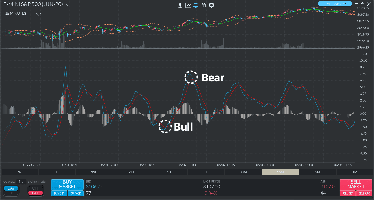
So, a signal line crossover takes place when the MACD line crosses above or below the signal line. The strength of the move determines how long the crossover will last. A bullish signal line crossover can be observed when the MACD line crosses above the signal line. On the contrary, a bearish crossover occurs when the MACD line crosses below the signal line.
On the chart below, you will see two highlighted examples of bullish and bearish signal line crossovers taking place. The traded instrument is ES. The blue line is the MACD line, while the red line is the signal line.
Zero Line Crossover
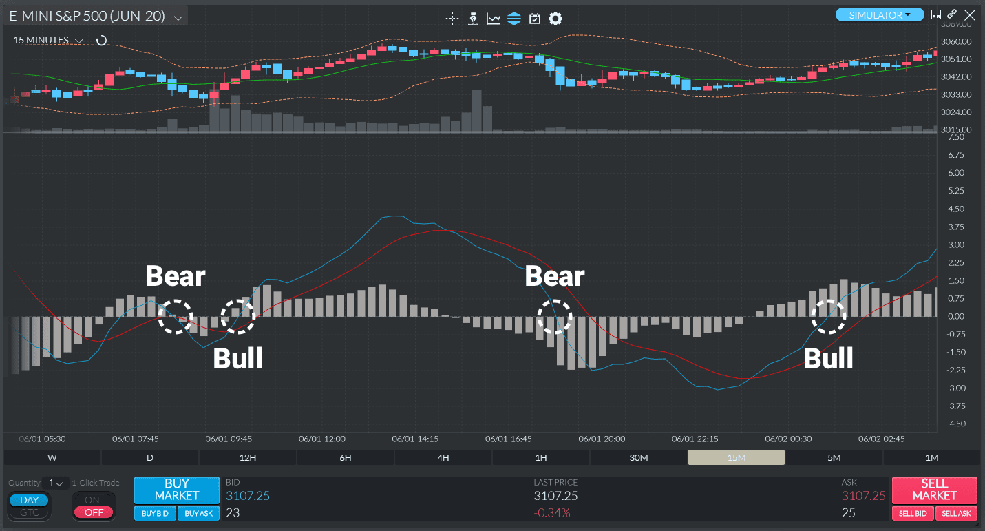
The zero line crossover, also known as “centerline crossover” takes place when the MACD line crosses the zero line and becomes either positive or negative. If the MACD crosses above the zero line and becomes positive, then we have a bullish crossover. If it crosses below it and becomes negative, then we have a bearish crossover.
On the chart below, you will see examples of bullish and bearish zero line crossovers taking place several times during the observed period. The traded instrument is AAPL. The blue line is the MACD line, while the orange line is the signal line.
MACD Divergence
The other highly valuable signal generated by the MACD is the divergence. Divergence describes a situation in which the MACD line and the price of the instrument move in the opposite direction. Due to its limitations, you should analyze the MACD divergence cautiously and always in addition to other signals. That is because it can often produce false positives (i.e., indicate a potential trend reversal that never materializes afterward). Aside from that, it rarely manages to predict all reversals that take place. In a nutshell, the MACD divergence can predict a number of reversals that don’t happen, as well as miss out on the real ones.
There are two types of MACD divergence – bullish and bearish. A divergence is bullish when the price of the instrument records a lower low while the MACD hits a higher low. Bearish divergence, on the other hand, describes a situation where the MACD records a lower high, while the price hits a higher high. Bullish divergences usually take place during strong downtrends, while bearish divergences occur in strong uptrends. On the charts below, you can see an example of both types.
8.5 Relative Strength Index (RSI)
The Relative Strength Index (RSI) is among the most widely used trading indicators in technical analysis. It was developed in 1978 by J. Welles Wilder Jr., singled out as “the premier technical trader publishing his work today” by Forbes magazine in 1980. Applied correctly, the RSI can help a trader recognize the signs of overbought and oversold markets
The Relative Strength Index is an indicator that helps traders capture market momentum by measuring the magnitude of price fluctuations. Traders use RSI to recognize oversold and overbought markets and decide on when to open a position. Thus, RSI compares the magnitude of average gains and average losses of security for drawing inferences about its strength and weakness over a predetermined time period.
The RSI scale is plotted from 0 to 100 with horizontal lines drawn at the 70 and 30 levels. An RSI reading above 70 is considered to be overbought. An RSI reading below 30 is considered to be oversold. The most popular time periods for the RSI are 9 and 14 days.
RSI shows the internal strength of the security.
The formula to calculate the RSI is as follows:
RSI= 100- (100/1+RS)
RS= Average Gain/ Average Loss
Let us understand this indicator with the help of the following example:
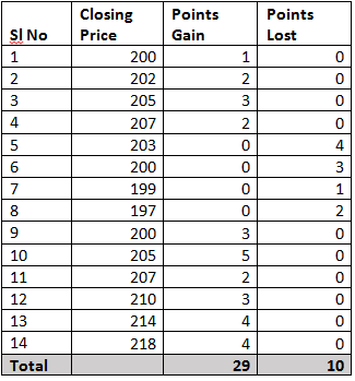
Assume the stock is trading at 199 on day 0, with this in perspective; consider the following data points:
In the above table, points gained/lost denote the number of points gained/lost concerning the previous day close. For example, if today’s close is 204 and yesterday’s close was 200, points gained would be 4 and points lost would be 0. Similarly, if today’s close was 204 and the previous day’s close was 207, the points gained would be 0 and points lost would be 3. Please note that the losses are computed as positive values.
We have used 14 data points for the calculation, the default period setting in the charting software. This is also called the ‘look-back period’. If you are analysing hourly charts, the default period is 14 hours, and if you are analysing daily charts, the default period is 14 days.
The first step is to calculate ‘RS’ also called the RSI factor. As you can see in the formula, RS is the ratio of average points gained by the average points lost.
Average Points Gained = 29/14
= 2.07
Average Points Lost = 10/14
= 0.714
RS = 2.07/0.714
= 2.8991
Plugging in the value of RS in RSI formula,
= 100 – [100/ (1+2.8991)]
= 100 – [100/3.8991]
= 100 – 25.6469
RSI = 74.3531
RSI calculation is fairly simple. The objective of using RSI is to help the trader identify oversold and overbought price areas. Overbought implies that the stock’s positive momentum is so high that it may not be sustainable for long, and hence there could be a correction. Likewise, an oversold position indicates that the negative momentum is high, leading to a possible reversal.
Ranges in RSI
When the RSI reading is between 30 and 0, the security is supposed to be oversold and ready for an upward correction. When the security reading is between 70 and 100, the security is supposed to be heavily bought and is ready for a downward correction.
8.6 RSI Indicator Buy and Sell Signals
Buy signals
We will take a look at three scenarios related to a trend reversal and trend confirmation indications. They are all observed during downward market movements.
Bullish oversold signal
The bullish oversold signal is a trend reversal signal that occurs in situations where the RSI falls below 30% and bounces back. There is no difference in how low it will go. The important thing here is for it to rise again above the 30% mark. Once it does, it is an indication that bulls are taking over, and a new upwards trend is forming.
How to trade it? Traders without open positions can go long. Traders who have closed their sell orders already can lock profits and open a buy order.
Bullish (positive) divergence signal
This is another trend reversal signal that occurs when the RSI and the price divert from each other. This happens when the price makes a lower low while the RSI marks a higher low. Depending on the number of times this event repeats, the trader can forecast the strength of the forming signal (the more, the better for the bulls). This comes to show that it is imperative to look at both – the RSI and the price movement.
Traders who spot positive divergence signals should be aware that short-term gains are around the corner. Combined with the indication of an oversold market, this signal is considered a very powerful trigger for buy orders.
Sell signals
Here we will also take a look at three scenarios, indicating trend reversal or confirmation signals. They are observed during upward market movements where the RSI indicates potential selling pressure.
Bearish overbought signal
The bearish overbought signal indicates when a trend reversal is about to take place. To spot such an indication, make sure to look for situations where the RSI surpasses the 70% mark and then falls back below it. Take this as a confirmation that bears are getting stronger, and a trend reversal is about to take place soon.
Traders with long positions can lock their profits and close their open positions so that they can exit the market with a sell. Traders without open positions can consider this signal as a green light to open a short position.
Bearish (negative) divergence signal
Opposite to the bullish divergence signal, the bearish one is observed when the RSI marks a lower high, and the price marks a higher high. Once again, the more repetitive this process is, the stronger the upcoming bearish signal will be. This is another trend reversal signal that confirms the importance of taking into account both the RSI and the price movements and not analyzing any of them in isolation.
The presence of a negative divergence suggests that the trader should expect a short-term decline in the prices of the traded assets. Technical analysts suggest combining it with the overbought signal to get a better indication of when you should be selling.
8.7 Real Life Application
At times other technical indicators and RSI are not perfectly aligned to confirm the trend’s occurrence. In this scenario- there is another interesting way to interpret RSI. Imagine the following two scenarios:
Scenario 1) A stock which is in a continuous uptrend (remember the uptrend can last from a few days to a few years) the RSI will remain stuck in the overbought region for a long time, and this is because the RSI is upper bound to 100. It cannot go beyond 100. Invariably the trader would be looking at shorting opportunities, but the stock, on the other hand, will be in a different orbit.
Scenario 2)A stock that is in a continuous downtrend, the RSI will be stuck in the oversold region since it is lower bound to 0. It cannot go beyond 0. In this case, the trader will be looking at buying opportunities, but the stock will be going down lower.
This leads us to interpret RSI in many different ways besides the classical interpretation –
- If the RSI is fixed in an overbought region for a prolonged period, look for buying opportunities instead of shorting. The RSI stays in the overbought region for a prolonged period because of an excess positive momentum.
- If the RSI is fixed in an oversold region for a prolonged period, look for selling opportunities rather than buying. RSI stays in the oversold region for a prolonged period because of an excess negative momentum
- If the RSI value starts moving away from the oversold value after a prolonged period, look for buying opportunities. For example, the RSI moves above 30 after a long time may mean that the stock may have bottomed out, hence a case of going long.
- If the RSI value starts moving away from the overbought value after a prolonged period, look for selling opportunities. For example, RSI moving below 70 after a long time. This means the stock may have topped out, hence a case for shorting.
8.8 Stochastics
A stochastic oscillator chart allows you to identify momentum in the price of a financial asset. At the core of this indicator is the stochastic oscillator formula. It compares the closing price of a security to the recent high and low prices. You then convert it into a figure between 0 and 100 which is the actual stochastic oscillator value.
On the one hand, the stochastic oscillator is an indicator of momentum both upwards and downwards. On the other hand, some traders see it as an indicator of overbought and oversold prices. Both are correct in theory. The critical difference is how you use the indicator within your investment strategy.
How Does the Stochastic Oscillator work?
The basic concept behind the stochastic oscillator is momentum. It gives you the ability to monitor the momentum of an asset’s price. Doing so lets you see whether it is potentially oversold or overbought compared to recent highs and lows. However, therein lies a potential conundrum.
A Simple Example
Picture the example of firing a rocket into the sky. It will not just suddenly stop and turn back to earth right away after running out of fuel. The fading momentum will continue to push it higher at a drastically falling speed. However, when the positive momentum eventually ends, the rocket will turn and head back towards earth. As a result, it builds up new momentum along the way. This is the idea behind the stochastic oscillator. Using the recent highs and lows for comparison, you should be able to identify a change in momentum. That result should be reflected in the charts as well.
There is a general consensus that when stochastic oscillator levels fall below 20, it indicates the asset is oversold. Meanwhile, if it moves above 80, that indicates the asset is overbought. Let us take 50 as our mid-value. In theory, the positive momentum is above the line, while the negative momentum is below it.
Stochastic Oscillator Formula
C= the most recent closing price
L14 = the lowest price traded over the last 14 trading sessions
H14 = the highest price traded over the last 14 trading sessions
%K = the current value of the stochastic indicator as a percentage
Lets take an example- For example, let’s assume Britannia has the following levels
Current level = 3555
Low point last 14 trading sessions = 3430
High point last 14 trading sessions = 3800
So the calculation is as follows:-
3500-3430/3800-3430 = 125/370
(125/370) x 100 = 33%
So, according to the stochastic oscillator indicator, Britannia has weak momentum and is potentially in “oversold” territory. Many people would class this as the standard stochastic oscillator indicator calculation based upon 14 trading sessions.
In Summary,
- Generally, the area above 80 indicates an overbought region, while the area below 20 is considered an oversold region.
- A sell signal is given when the oscillator is above the 80 level and then crosses back below 80.
Conversely, a buy signal is given when the oscillator is below 20 and then crosses back above 20.


